
Developer interview · Part 9 of 12Sticking with it
What do red, yellow and green mean on Data2Dao's body heat map?
The body heat map on Data2Dao's home screen records how each body part feels in four states: red, yellow, green and transparent. This post explains what each color means, what feedback you give after a session and the next morning, what the app does when a part keeps getting worse, and what to do if a move hurts.
Short answer
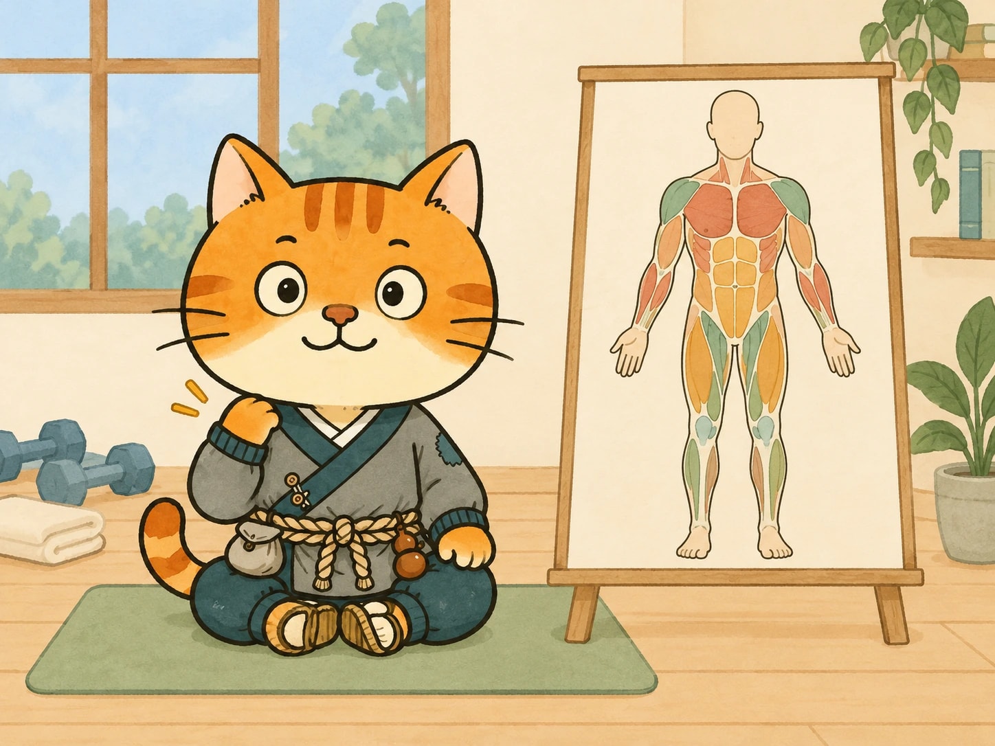
The body heat map on the home screen marks each body part with one of four states: red is pain, yellow is a bit tight, green is good or worked, and transparent is no feedback yet. After each session you give feedback on intensity, duration and the moves you liked, and the next morning you mark which parts got better and which got worse. If a part keeps getting worse, the app links it to the moves you did and suggests you stop doing that move for now.
Key points
| Color | Meaning |
|---|---|
| Red | Pain |
| Yellow | A bit tight |
| Green | Good, or this muscle got worked |
| Transparent | Not touched yet, no feedback |
- Feedback after a session: how tired you are, in four levels (slightly, a bit tired, very tired, exhausted); whether you want next time's intensity and duration a bit higher or a bit lower; your favorite move and the move you want to block.
- The next morning: in your review, you mark which body parts are better than yesterday and which are worse.
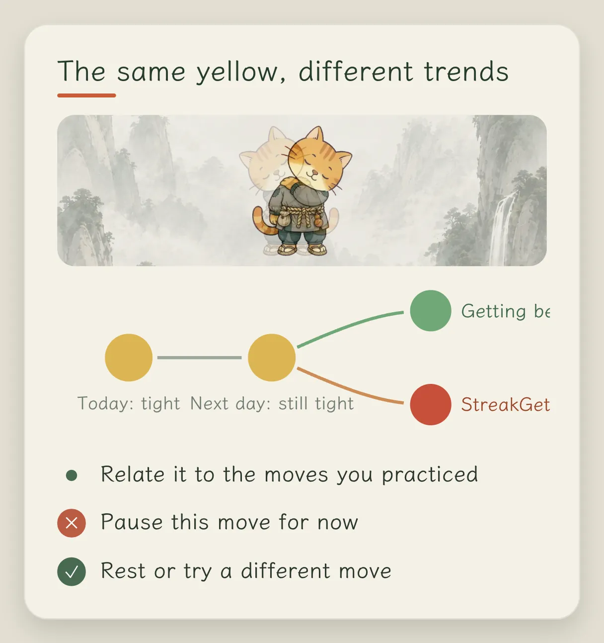
- Getting worse several times in a row: the app links that body part to the moves you did and suggests you stop that move for now, and rest or switch to something else.
- Manual avoidance: you can set a body part to be skipped for this stage or long term.
- Factors: the home screen has a Factors card, and coffee can be logged by the time you drank it. Fuller trends and attribution in reviews and weekly reports are still in development.
What the colors mean
What do the colors on the body figure on the home screen mean?
Red is pain, yellow is a bit tight, green is good, or you could say that muscle got worked, and transparent means it hasn't been touched yet and there is no feedback.
You can also mark a trend. Say you have been sitting all the time for the past few days and your shoulders and back are yellow. After a few days of practice they are still yellow: not red, but not back to green either. Even though it is the same yellow, you can mark whether it has gotten better or worse. If you have kept doing a certain move and that part gets worse several times in a row, it may be related to that move, and the app will suggest you stop doing it for now, rest a bit, or switch to another move.
Feedback after a session
After the first battle, what do you hope people feel in their bodies?
I hope you can feel that your muscles were used, with just a little soreness. How much is right differs from person to person.
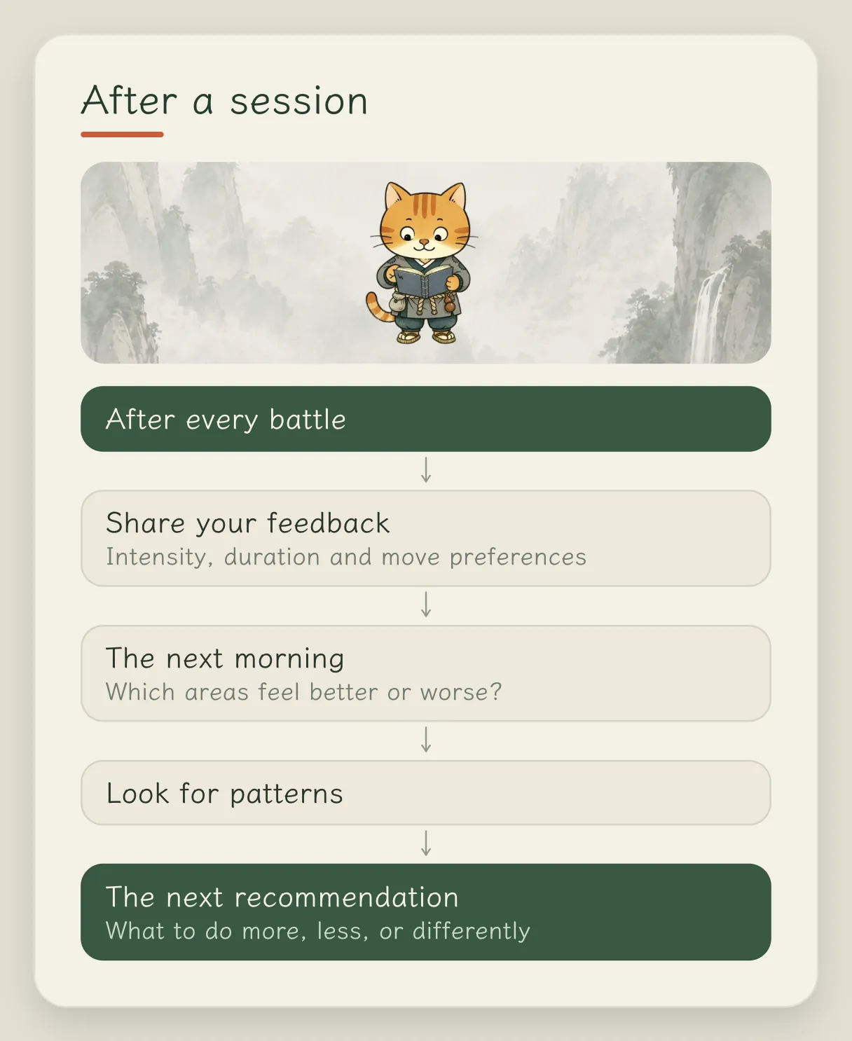
So after every battle it asks you for feedback: should the intensity be a bit higher or lower next time, should it be a bit longer or shorter, which move you liked most this time, and which move you want to block. In the review the next morning, you look at which parts of your body are better than yesterday and which are worse. These are linked together and analyzed, and then it tells you what to do more of, what to do less of, and where you should train more.
Which data do you most like to look at yourself?
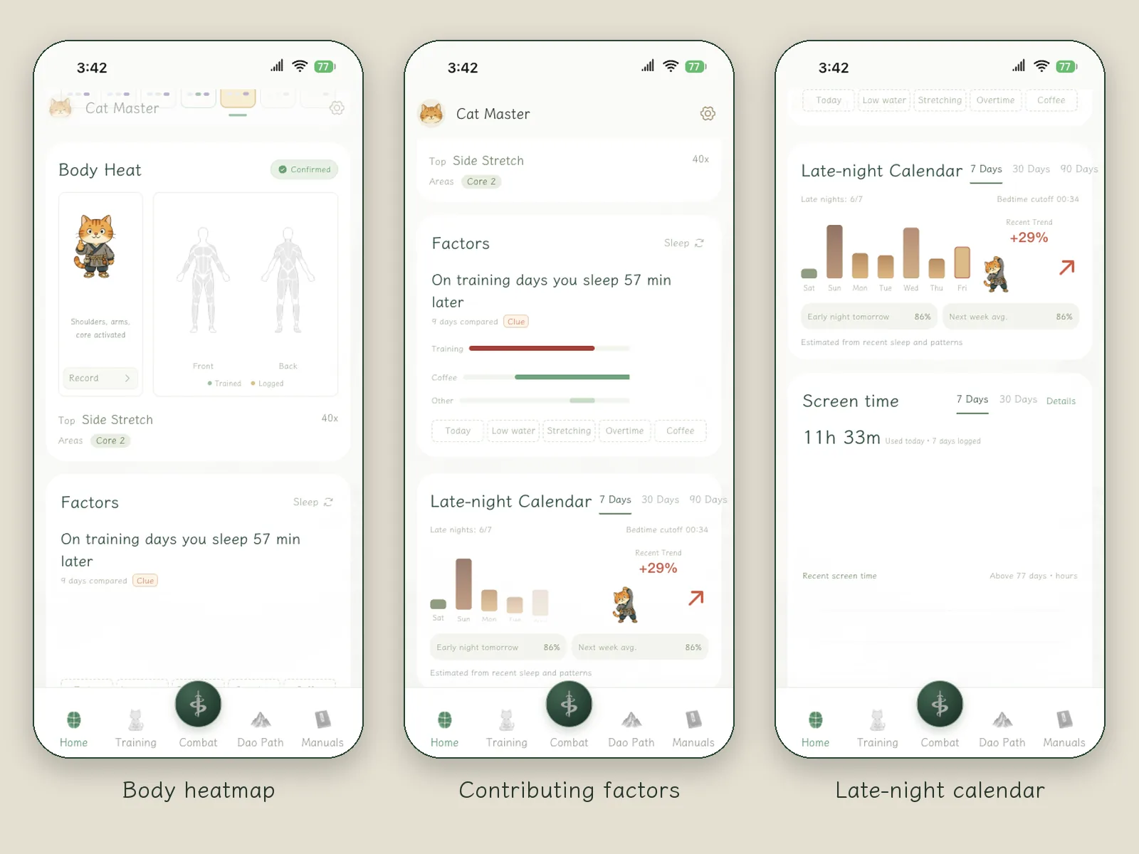
I really like the quantified life. After using it for a while, what I most like to look at are the muscle heat map, the changes in my sleep and the Late-night Calendar.
The key thing in all this data is attribution. I log whether I had coffee or alcohol today, whether I practiced in the morning or the afternoon, how long I practiced and what I practiced, and then I look at how these relate to sleep and mood. That gives me a better handle on my own life.
What the developer worries about most
What worries you most about these moves?
Intensity. Whether frequency, duration and intensity added together are too much, not enough, or counterproductive.
The current algorithm and feedback were mostly worked out by testing on myself over and over, so I especially hope everyone gives plenty of feedback, and I will iterate new Training Plans based on it. One more thing: if a move really hurts when you do it, please be sure to mark that spot red, and the app will avoid it for you.
FAQ
What should I do if a move hurts?
Stop first and mark that body part red. The app will then avoid the related moves. The prompt in the app is: when pain is fairly strong, training stops for today; if it keeps getting worse, rest first or consult a professional.
Can I set a body part not to be trained?
Yes. You can set it to be avoided for this stage only, or long term.
Can the heat map tell what is wrong with my body?
No. It records the sensations you mark yourself and uses them to adjust what you practice afterward. Data2Dao does not make medical diagnoses.
Related articles



Done reading? Stand up for three minutes
Prop your iPhone up and follow the cat for a few moves. Free to download; the annual plan includes a 7-day free trial.